What opens up valuable opportunities for businesses usually rides on the back of good designs. More often than not, the importance of design is being underestimated or is being treated more as an afterthought. On the contrary, good design can bring significant benefits to your business.
Designing for business and marketing is different from let’s say personal artworks or illustrations where you can let your imagination run loose. This is not to say that you can’t do the same for business and marketing designs. However, there are certain elements and techniques to be considered to make your design as effective as possible because the main goal is to sell your service/product.
So, how can you impress, engage, and convert your marketing design?
Don’t fret! In this post, we’re going to share our very own top winning design tips to make them stand out and convert-worthy.
Keepin’ It Clean
A good design doesn’t necessarily mean that you need to fill every single space on the canvas with text and graphics.
Once you’ve got the initial visual done and it may have too many elements in it, take a step back to evaluate and ask yourself whether all of the extras are really necessary and add value. This should help you determine what changes you need to make your design look as clean as possible.
Remember: Less is more!
The Beauty of Contrast
Contrast has the power to make your designs stand out when you want to communicate something online as well as keep someone’s attention.
Make use of color, size, alignment, repetition, proximity, texture, and whitespace to create contrast. When putting together just the right amount of everything, you can make your marketing materials much more appealing.
Here are some examples:
Emphasizing a message
Make that more prominent than other elements in your design.
Highlighting emotion
Colors can express different emotions, so use colors in your visual that match the emotions that you want to convey to your audience.
Repetition
By doing this, you can create an identity for certain parts of your design. At the same time, by using repetition it emphasizes the importance of a certain element that you want your audience to catch.
Importance of whitespace
It is important to utilize whitespace to avoid overwhelming your audience with information overload.
Texture
Make your design look more alive by making use of a textured background. People are more likely to react and respond to an ad that pops out by using texture rather than plain colors.
Fonts
When you either stumble upon or already are utilizing a design tool, you might be tempted to use all the coolest and best-looking fonts as much as you can in one design, but that won’t gain your design any benefits.
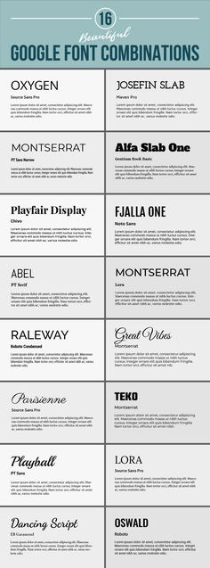
If you want to utilize more than one font, it’s best to choose at least a pair of fonts. Have one font that represents your business. However, if you want to add dynamics to your visuals, find a font that complements your main font.
Here are some great examples of font pairing:

Brand Guidelines
When creating a great marketing design you have to make sure that all the materials you’re using are following your brand guidelines. What this means is making sure that you incorporate your log, color palette, consistent typography, and other brand elements that are all your brand’s.
The goal you want to achieve is to keep a unified brand presence as well as consistent through all your marketing channels.
Playing with Lines
It may be a quite simple element, but lines are extremely important as well as versatile that does more than just simply underline something or add for effect.
Whether they are long, short, dotted, curved, straight, vertical, horizontal, diagonal, or even to connect the dots, thick or thin, you can use this element to enhance your messaging and create eye-catching visuals.
A great way to use lines to increase the visual appeal of your design is by organizing the information by separating grouping elements, using different types of lines to emulate textures, guiding the audience’s eye to a certain section that provides important information, and making a statement by using a variation of the dimension of the lines.
Collaboration
There should always be a collaboration between the marketing and the design team. The reason for this is so that the work of the marketing team and the creative ideas of the design team aligns with both visions.
By collaborating, everyone is able to have a chance to insert their valuable feedback. Your marketing designers are able to mark their progress on projects so that the overall vision is clear to each team member.
Don’t forget that collaboration is the heart of marketing design.
Conclusion
When great marketing and great designs come together, great results are birthed. Keep having an open and transparent line of communication between your marketing and design team as well as equip them with all the right tools. We hope that this list helped shed light on how to effectively use the different elements of design to create a compelling marketing message that catches people’s attention and converts them into leads.


